Subtitle Font Size: The Right Size for Reels, Shorts and YouTube
Find the right subtitle font size for Reels, Shorts and YouTube: a px cheat sheet, safe zone tips, Hindi sizing advice and a 2-minute phone test.

On this page
- What is a good subtitle font size?
- Why pixel sizes differ between apps
- Subtitle font size cheat sheet by platform
- Font size for Reels and Shorts captions
- Mind the safe zone
- Font size for YouTube subtitles
- Hindi and Devanagari captions need extra room
- How do I test if my subtitle font size is right?
- Common mistakes with caption size
- Setting caption size faster in GetNixa
- Final thoughts
- Frequently asked questions
The right subtitle font size depends on where your video plays. Text that looks huge on a laptop timeline can turn tiny on a 6-inch phone, and text that fits a reel can swallow a 16:9 YouTube frame.
This guide gives you starting sizes for Reels, Shorts and YouTube, explains why pixel numbers differ between apps, and shows a quick test to check any size before you post.
Quick answer: On a 1080 x 1920 vertical video, start captions at about 60 to 80 px, going bigger for one to three words at a time. On a 1920 x 1080 YouTube video, start at about 45 to 60 px. Then preview on a real phone at arm’s length and adjust.
What is a good subtitle font size?
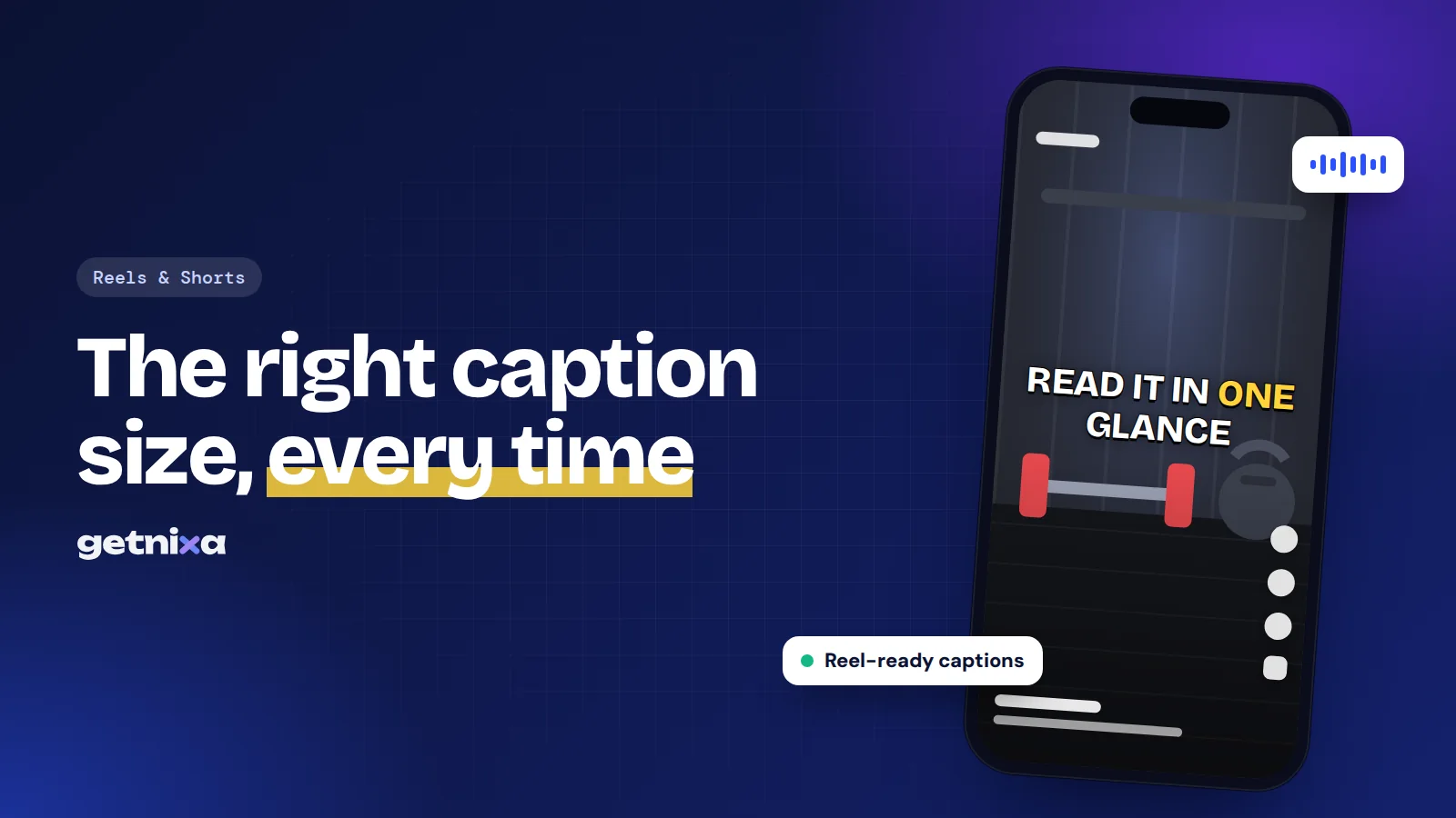
A good size is one your viewer can read in a glance, without the text covering the action. There is no single number, because three things change the answer: the frame size, the screen people watch on, and how many words you show at once.
So treat any number as a starting point. The sizes in this post come from practical editing on phone-first content, not from a rule set by Instagram or YouTube. Neither platform publishes an official caption size for creators.
Why pixel sizes differ between apps
A “font size” in an editor is not a fixed physical size. Some apps measure in pixels of the video frame, some in points, and some use a slider with no unit at all. So “60” in one app may look different from “60” in another.
A more reliable way to think about it is height on screen. Ask how tall the letters are compared with the full frame. On vertical video, caption letters that fill roughly a thirtieth of the frame height usually read well on phones. On 16:9 video, the text can take a smaller share because the screen is often larger.
Subtitle font size cheat sheet by platform
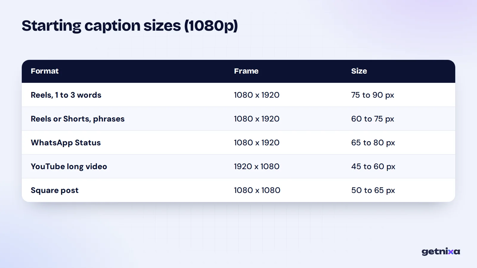
These are working ranges for 1080p projects. If you edit in 4K, double the pixel numbers.
| Format | Frame | Caption style | Starting size | Lines |
|---|---|---|---|---|
| Instagram Reels | 1080 x 1920 | 1 to 3 words, animated | 75 to 90 px | 1 |
| Instagram Reels | 1080 x 1920 | Short phrases | 60 to 75 px | 1 to 2 |
| YouTube Shorts | 1080 x 1920 | Short phrases | 60 to 75 px | 1 to 2 |
| WhatsApp Status | 1080 x 1920 | Short phrases | 65 to 80 px | 1 to 2 |
| YouTube long video | 1920 x 1080 | Full sentences | 45 to 60 px | Up to 2 |
| Square post | 1080 x 1080 | Short phrases | 50 to 65 px | 1 to 2 |
Why is WhatsApp a little bigger? Status videos are often re-compressed and watched on budget phones, so thin, small text breaks up faster. A slightly larger, bolder font holds up better.
Font size for Reels and Shorts captions
Vertical video is watched on a phone held about a forearm’s length away. So the text has to work on a small screen, often in sunlight, with the sound off.
- Word-by-word captions can go large, because only one to three words show at a time. This is the bold, punchy style many creators use for hooks.
- Phrase captions of four to seven words need to be smaller so they fit on one or two lines.
- Full sentences rarely suit Reels. If you need them, break them into shorter chunks rather than shrinking the text.
For Shorts captions, some people watch in a desktop browser too, where the vertical player is narrow. That is one more reason not to go below the low end of the range. Our guide to YouTube Shorts captions covers styling for that format.
Mind the safe zone
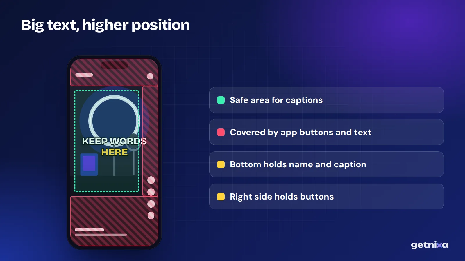
Size and position work together. The bottom of a Reel or Short carries the username, caption text and music label, and the right side holds the like, comment and share buttons. Large text placed low will hide behind them.
So when you increase the size, move the text up toward the middle third of the frame. Our post on open vs closed captions explains why burned-in text needs this extra care.
Font size for YouTube subtitles
On a regular 16:9 YouTube video, you have two choices: burn the subtitles in, or upload a caption file.
If you upload a file, the size is not in your hands. Viewers set it themselves. According to YouTube’s subtitle settings help, a viewer on a computer can open Settings, then Subtitles/CC, then Options, and change font, colour, size, background and edge style.
If you burn them in, aim for text that fits a full line of dialogue without crowding. Netflix’s English timed text style guide is a useful benchmark: it caps lines at 42 characters, allows a maximum of two lines, and sets font size relative to the video resolution so 42 characters fit across the screen. A size in the 45 to 60 px range on a 1080p frame usually meets that.
Hindi and Devanagari captions need extra room
Devanagari letters carry vowel signs above and below the main line, and words are joined by a top bar. At the same point size, Hindi text can look smaller and denser than English.
- Go one or two steps larger than you would for English in the same frame.
- Add line spacing so marks on the top line don’t touch the line below.
- Use a font built for Devanagari, since some decorative English fonts fall back to a plain system font for Hindi.
- Hinglish in English letters often makes longer words than Hindi in Devanagari, so check that phrases still fit on one line.
Our guide on Hinglish captions covers when to choose English letters over Devanagari.
How do I test if my subtitle font size is right?
This five-step test takes under two minutes and works in any editor.
- Export a short sample. Render 10 seconds with your busiest captions, not the whole video.
- Send it to your phone. Watch it full screen, the way your viewers will.
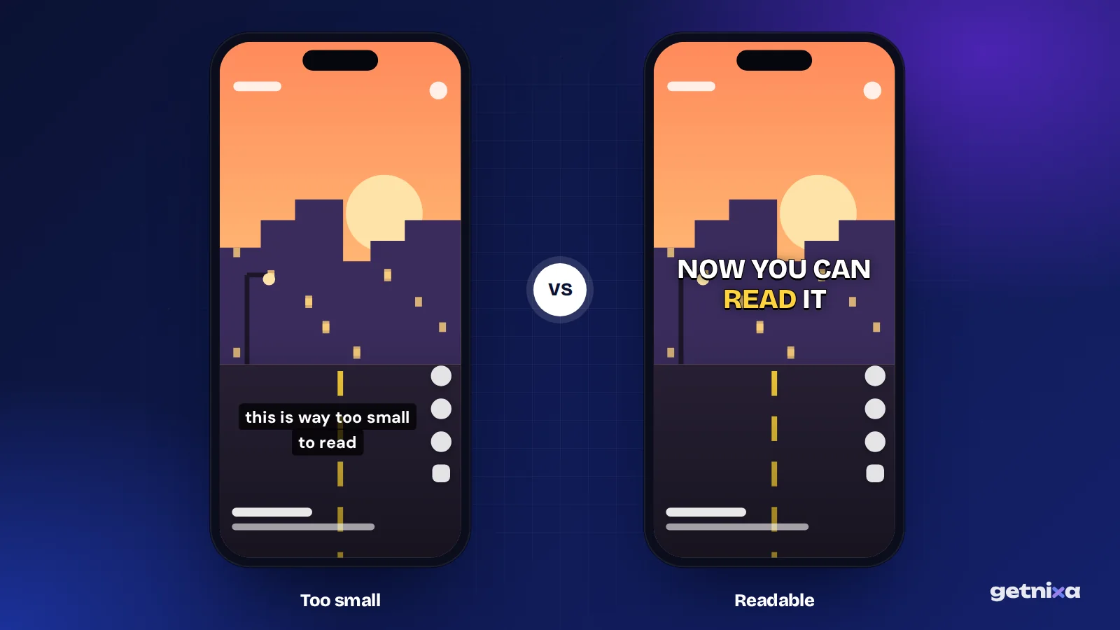
- Hold the phone at arm’s length. If you squint or lean in, the text is too small.
- Watch with the sound off. Check that you can finish each line before it disappears.
- Check the edges. Open the clip in the Instagram or YouTube upload preview and make sure no button hides the text.
Tip: Test on the cheapest phone you can borrow. If the text reads well there, it will read well on most of your audience’s screens.
Common mistakes with caption size
- Judging size on the timeline. Fix: your editor preview is often bigger or smaller than a phone. Always test the export.
- Going huge to grab attention. Fix: giant text covers faces and products. Use bold weight and a contrasting colour instead of extra size.
- Thin fonts at small sizes. Fix: choose bold or semi-bold weights with an outline or shadow. See our list of best fonts for Reels captions.
- Three-line captions. Fix: split the text into two shorter captions instead of shrinking it.
- Same size for every format. Fix: when you reuse a reel as a YouTube video, resize the captions for 16:9.
- Forgetting the 4K jump. Fix: in a 4K timeline, pixel sizes need to double to look the same.
Setting caption size faster in GetNixa
If you don’t want to tune sizes by hand, GetNixa is one option. It has 100+ caption templates already sized for vertical video, including word-by-word and animated captions. The Free plan includes 12 of them.
You upload a video, pick the spoken language, and the AI writes captions timed to the voice. Then you can change the font, colours, position and animation, and preview before export. Hindi can come out in Devanagari or Hinglish. The optional AI Auto edit also keeps captions off the face.
When you are happy, export an MP4 for Reels or Shorts from the Reels caption generator, or an SRT file if you would rather let YouTube viewers set their own size. There is no watermark on any plan.
Final thoughts
Start with the ranges above, then trust the phone test over any number. Big enough to read at a glance, small enough to keep the picture clear: that is the right size.
Get captions that are sized for phones from the start. Pick a template, adjust font and position, and preview before you export.
Frequently asked questions
What font size should captions be on Instagram Reels?
On a 1080 x 1920 Reel, start around 60 to 75 px for short phrases and 75 to 90 px for one to three words at a time. Instagram doesn’t publish an official size, so treat these as starting points. Test the export on a phone at arm’s length and adjust until you can read each line in a glance.
What is the standard subtitle size for YouTube?
YouTube has no single standard for burned-in text. For a 1920 x 1080 video, about 45 to 60 px works well for full sentences on up to two lines. If you upload a caption file instead, viewers choose the size themselves in the player’s Subtitles/CC options, so you don’t set it.
How many characters should a subtitle line have?
For full-sentence subtitles on widescreen video, a common benchmark is a maximum of 42 characters per line and two lines, as set in Netflix’s English style guide. For Reels and Shorts, fewer is better: short phrases of about four to seven words keep the text large and easy to read.
Should Hindi subtitles be bigger than English?
Usually, yes. Devanagari has vowel signs above and below the main line and a top bar joining letters, so it can look smaller and denser at the same size. Go one or two steps larger than English, add a little line spacing, and use a font designed for Devanagari.
Does subtitle size change in 4K?
Yes. Pixel sizes are relative to the frame, so a 4K frame needs roughly double the pixel value to look the same as in 1080p. A caption set at 70 px in a 1080p project would need about 140 px in a 4K project to appear the same size on screen.

Written by
GetNixa Team
The team behind GetNixa, the AI caption app for Indian creators. We write practical guides on captions, editing and growing on Instagram and YouTube.